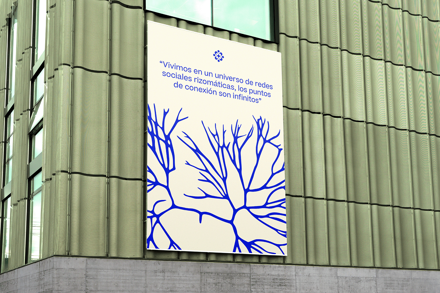


Risomi is a digital agency specialized in making strategies that go beyond the ordinary and explore new narratives. The name takes inspiration from the word "Rhizome," a concept referring to stems with horizontal roots seeking connection points with other roots, much like the digital environment: an inherently rhizomatic space.
For the logo, a custom-made typography was designed with high contrast and details that break with the straight framing of the logo, giving it a modern, youthful and dynamic touch. The icon is an abstract representation of networks, speaking about the links and connections that occur to form new ideas and systems.
The secondary graphics illustrate natural elements with hints of the digital world: plants and fungi mixed with folders, pixels, tabs and batteries, speaks about the analogy made between nature and technology, while making the applications visually appealing.
The color palette does the exact same thing: it combines earthy colors with a bright blue hero color, most present in hyperlinks, again reinforcing the digital and natural contrast within the brand's identity.
Credits
Art Direction: Mariela Mezquita // Design and illustration: Dani Martínez de Castro //
Photography and Set Design: Andrea Pastrana // Client: Risomi
Thanks for watching!